
Path before pixels
Map the real decision flow before changing colours, layouts, or component libraries.
Our Services Conversion-Focused Interface Design
Conversion-focused interface design for digital products that need clearer paths to signup, upgrade, enquiry, or activation — without dark patterns. Zyvor designs trust, hierarchy, and CTAs so Design and Growth share the same outcome.
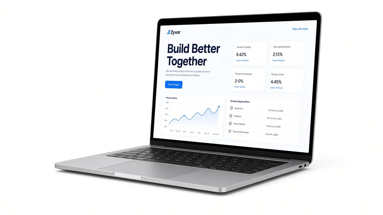
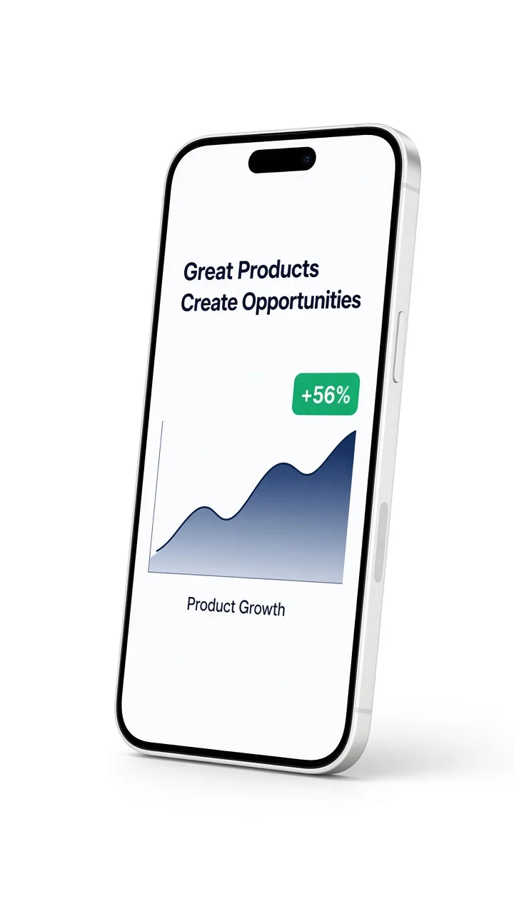
Path review first
Trust before tactics
No dark patterns
Handoff to build
Service overview
What it is
It is the work of making the next useful action obvious — signup, demo, enquiry, or activation — by fixing hierarchy, trust, copy placement, and friction in the screens people actually use.
Who it is for
It is for teams with traffic or a live product who still lose people at pricing, onboarding, or the first session. Founders and growth leads use it when the offer is real but the interface hides it.
The business problem
Conversion problems are often UX problems: a buried offer, competing CTAs, weak proof, or a first-run flow that asks too much too soon. Traffic then looks like a marketing issue when the interface is the bottleneck.
How Zyvor approaches it
Zyvor reviews the conversion path, redesigns the few screens that carry the decision, and hands a clear spec to growth and engineering. The goal is a cleaner job-to-be-done, not a louder button.
Map the real decision flow before changing colours, layouts, or component libraries.
Proof, offer, and next step sit in an order a first-time visitor can follow.
No dark patterns. The interface helps the right user continue — it does not trap them.
Screens, states, and copy notes that Design, Growth, and engineering can ship from.
The core outcomes this service is structured around — before related delivery paths and stack detail below.
Walk the signup, demo, enquiry, or upgrade journey and name where people stall, bounce, or lose trust.
View detailRedesign the few screens that carry the decision: landing, pricing, onboarding, and the first successful action.
View detailPlace proof, offer, and risk-reducers so the next step feels safe — not louder than the product.
Clarify plans, comparisons, and objections on the surfaces that decide whether someone starts.
Reduce first-session friction so the product shows value before the user is asked to commit more.
Specs, states, and copy that Growth can test and Technology can implement without reinventing the flow.
View detailThe same design discipline, adapted to whether you are fixing a marketing site, a product funnel, or both.
Traffic exists; conversion lags Signup, demo, or upgrade drop-off that looks like a channel problem but is an interface and hierarchy problem.
The product is real; the path is not A clear offer buried under competing CTAs, weak proof, or an onboarding flow that asks too much too soon.
Experiments without a design system of truth Tests that change buttons without fixing the journey. We give both teams one conversion path to work from.
Common challenges
Traffic arrives, but signup, demo, or enquiry still stalls.
Pricing, onboarding, or first-session flows feel unclear or heavy.
Growth tests change CTAs without fixing trust or hierarchy.
Engineering cannot implement ‘make it convert’ as a ticket.
How Zyvor helps
A reviewed path with one primary next step and proof placed where the decision happens.
Redesigned screens that show value early and ask for commitment in the right order.
A shared conversion surface Design and Growth can iterate on without dark patterns.
States, copy, and component notes that hand off cleanly into product engineering.
01 Review
Walk the live path and name the screens, states, and copy that lose people.
02 Diagnose
Separate traffic issues from hierarchy, trust, and friction in the first session.
03 Redesign
Redesign the few decision screens — not the whole product — around one clear next step.
04 Specify
Document states, proof, and CTAs so Growth and engineering can ship without guesswork.
05 Handoff
Align Design with Growth experiments and product engineering for implementation.
06 Measure
Leave a clear way to see whether the next step actually got easier.
Interface design for conversion still has to land in a real product. These are tools Zyvor uses when the work moves from review into screens and handoff.
Part of the delivery stack when Figma fits the product stage.
Part of the delivery stack when React fits the product stage.
Part of the delivery stack when Next.js fits the product stage.
Part of the delivery stack when TypeScript fits the product stage.
Part of the delivery stack when Stripe fits the product stage.
Part of the delivery stack when Vercel fits the product stage.
SaaS
eCommerce
Marketplace
Business Services
Healthcare
Education
Professional Services
Enterprise Ops
And more
Selected Zyvor products where enquiry, signup, or evaluation had to be obvious — not invented conversion metrics.
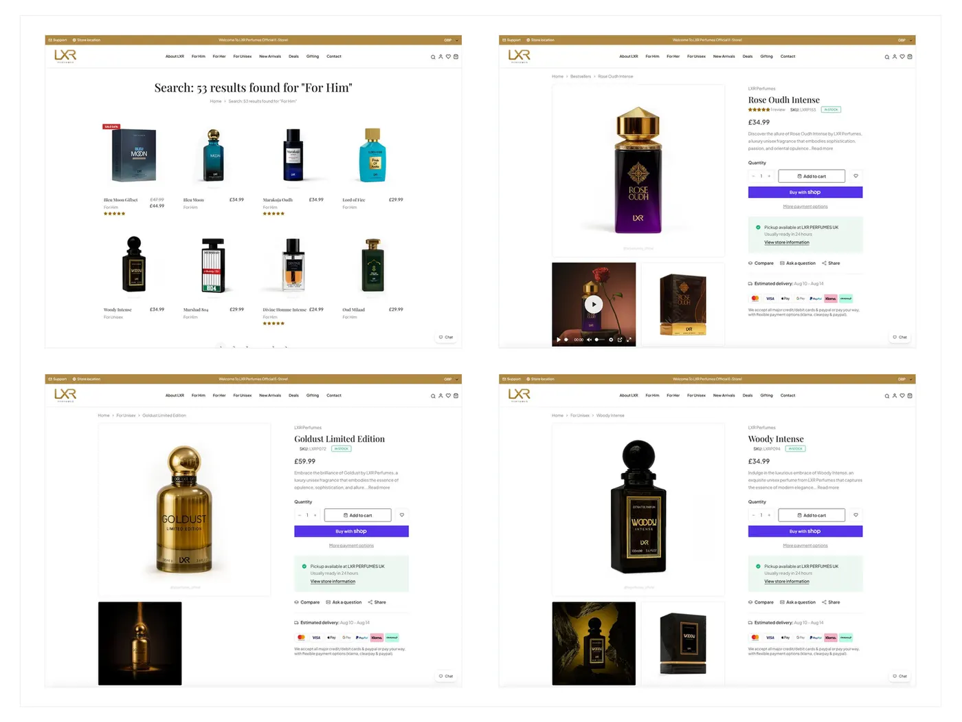
Luxury eCommerce
A premium fragrance eCommerce experience built around discovery, merchandising, reusable product pages, responsive shopping, cart, and checkout.
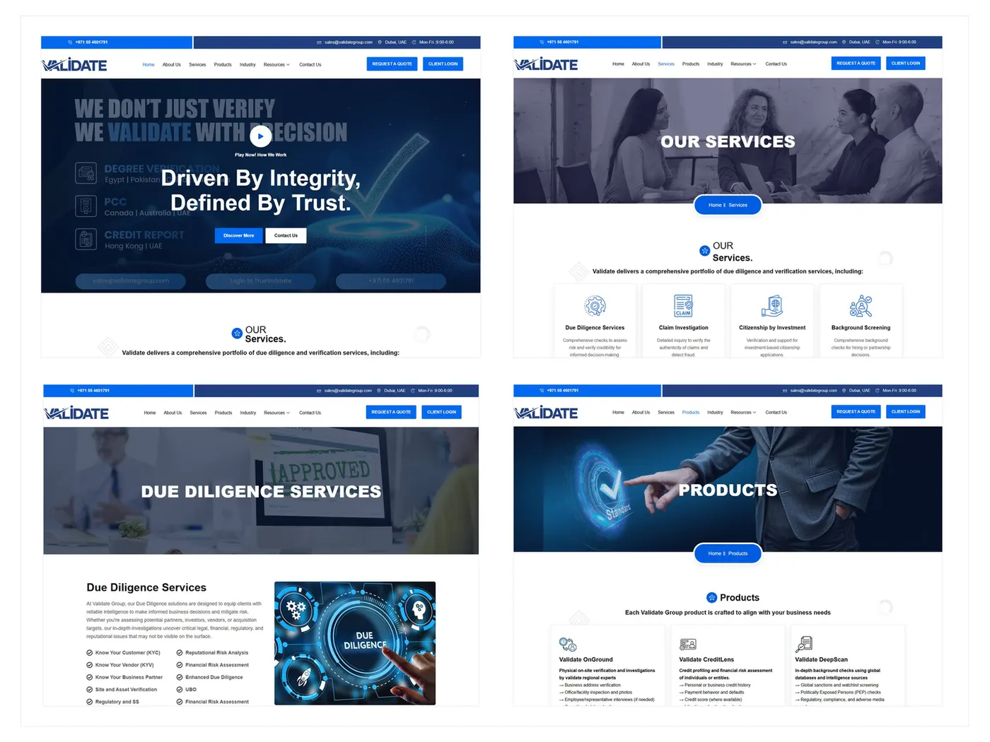
B2B Corporate Website
A responsive B2B corporate website presenting verification, due diligence, products, trust content, resources, and enquiry journeys.
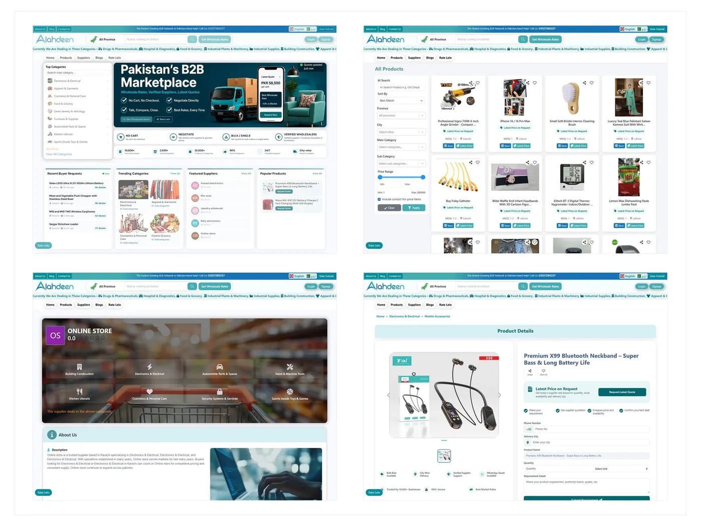
B2B Marketplace
A multi-vendor B2B marketplace connecting wholesale buyers, suppliers, catalogs, storefronts, leads, quotations, and seller operations.
Share the live path and the action you need users to take. We will tell you whether the bottleneck is the interface — and what to redesign first.