
Product pressure
What the business needed to make true before the next stage of growth.
Case Study
The Sarwar Group
Corporate Website
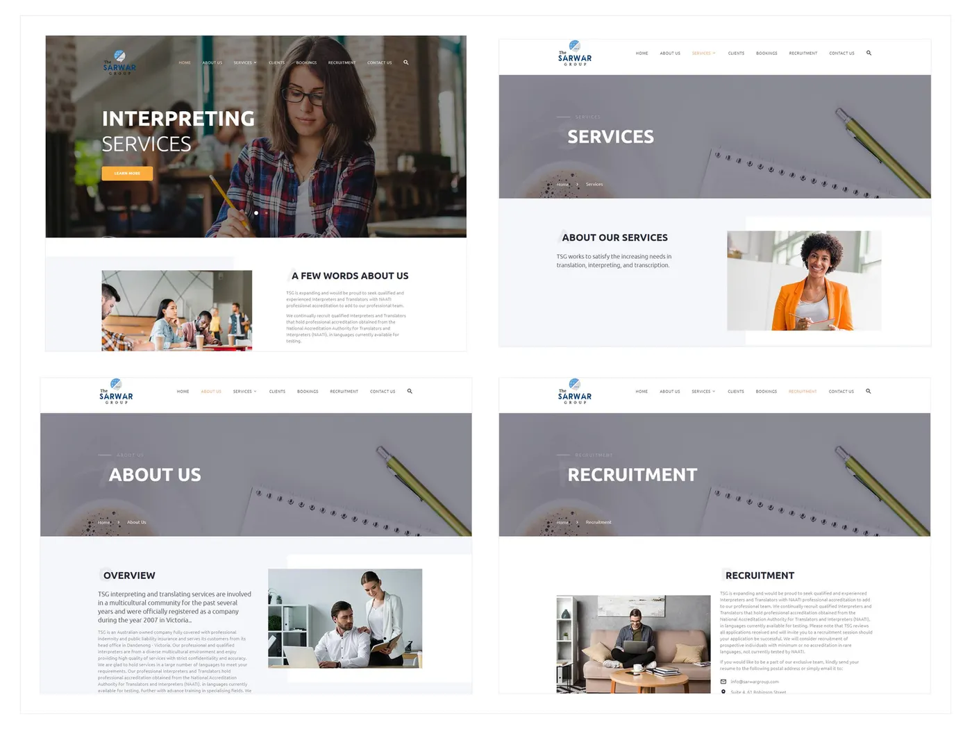
Zyvor designed and developed The Sarwar Group website to unify translation, interpreting, recruitment, credibility and enquiry journeys — so visitors could understand the full firm without navigating three different sites.
Consistency over complexity.
Industry
Language Services / Recruitment
Services
Information Architecture, Web Design & Development, SEO
Engagement
Design and development
Timeline
January 2023 – March 2023
Product type
Multi-service corporate website
Case study structure
Overview
Zyvor designed and developed The Sarwar Group website to unify translation, interpreting, recruitment, credibility and enquiry journeys — so visitors could understand the full firm without navigating three different sites.
What the business needed to make true before the next stage of growth.
How strategy, design, and engineering stayed connected through the engagement.
The decisions that kept ownership, state, and next actions clear for the team.
Why the work was sequenced for trust, scale, and a reusable foundation.
Challenge
Translation, interpreting and recruitment are related but different. Without a shared information hierarchy, each line starts to feel like a separate mini-site and enquiry becomes fragmented.
Signal
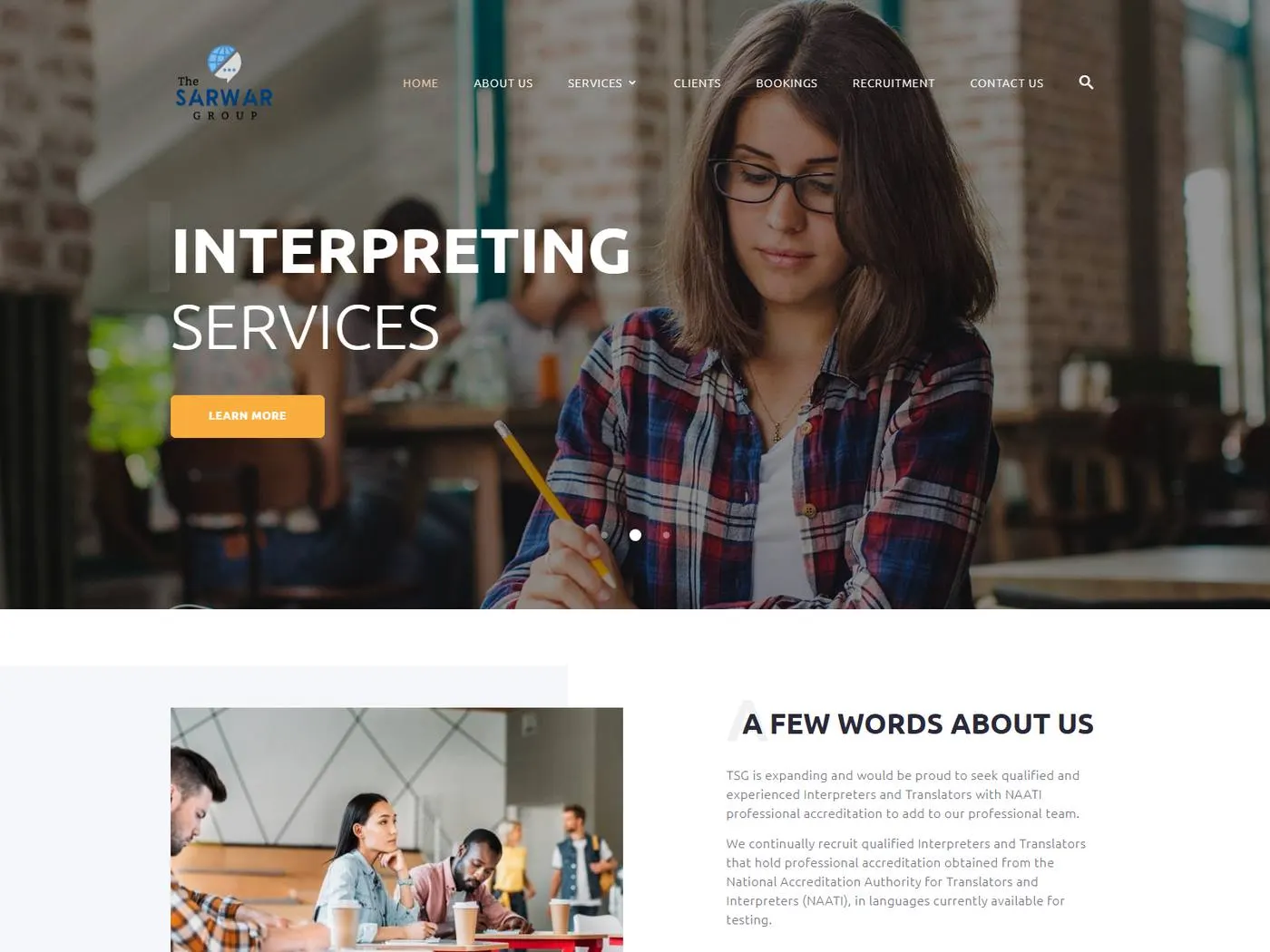
Main corporate page
Context
One structure. Distinct services.
Corporate homepage presenting language and recruitment services.
The firm needed one digital presence that could carry several professional offerings without flattening the differences between them.
Visitors needed to find the relevant service quickly, then still understand the wider company.
Reusable page patterns were needed so service lines could be maintained consistently.
Different layouts per service, competing navigation attention and distant credibility content all increased confusion.
What was breaking
The friction points that made the old approach expensive to keep.
Every service page using a different layout
Recruitment and language services competing for attention
About and credibility too far from evaluation
Mobile users unable to see the full service mix quickly
Inconsistent contact paths across services
Strategy
If translation, interpreting and recruitment shared navigation and page patterns, the firm could look coherent while each service stayed specific.
Define the main service lines clearly
Use common page patterns for each service
Keep corporate credibility visible across the site
Make contact paths consistent from every service area
Solution
Zyvor organised the service lines through a common information hierarchy, then built reusable responsive pages, credibility content, enquiry pathways and technical SEO.
Discover
Mapped translation, interpreting, recruitment and company credibility as one visitor journey.
Define
Set a shared corporate navigation model and reusable service page components.
Design
Created a professional multi-service experience that stays scannable on mobile.
Build
Implemented the site structure, contact integration, analytics, SEO, QA and deployment.
Launch / Scale
Left a consistent pattern so additional service content can be added without a new IA.
Strategy — Key Decisions
These are the choices that shaped the product — not a gallery of what shipped, but why the work was sequenced this way.
Fragmented navigation makes a multi-service firm feel harder to understand than it is.
Translation, interpreting and recruitment should be comparable, not visually unrelated.
About and trust content have to stay close to service evaluation.
Every service line should lead to the same quality of contact experience.
Mobile visitors need to grasp the service mix without a desktop sitemap.
Design
Visitors should identify the relevant service, understand the company behind it, and enquire without losing the thread.
Multi-service corporate websites need consistency more than complexity.
Corporate homepage presenting the full mix without burying any line
Dedicated translation, interpreting and recruitment pages
Shared patterns so service pages feel like one firm
Contact available from every service area
Trust, clarity and accessibility
Professional services buyers look for coherence as a quality signal
Recruitment and language services can coexist if navigation is honest
Mobile clarity is part of credibility
Main corporate page
Corporate homepage presenting language and recruitment services.
Services
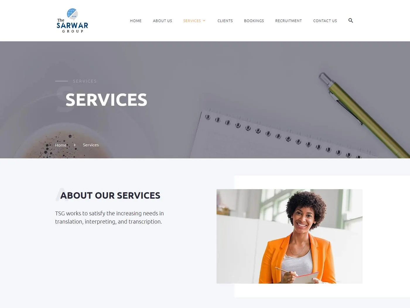
Service page structure for multi-service navigation.
Recruitment
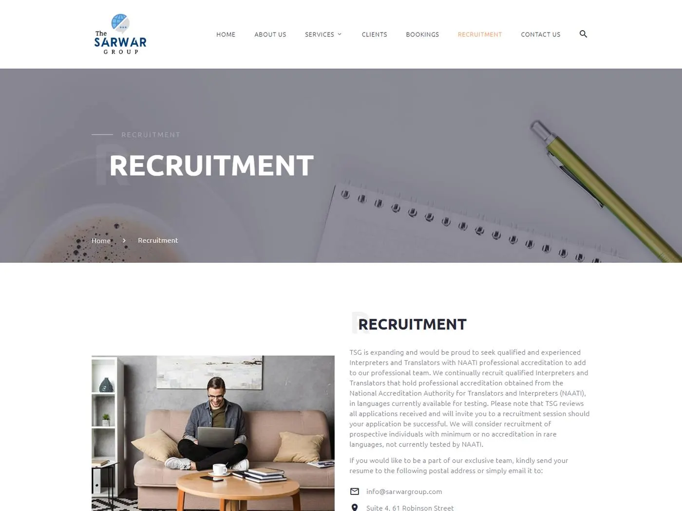
Recruitment service content within the shared corporate site structure.
Development
The website was delivered with HTML, CSS, JavaScript, a responsive framework, contact form integration, analytics, SEO tooling and hosting/SSL.
A shared navigation model across service lines.
Common patterns for translation, interpreting and recruitment.
Consistent contact pathways from every service area.
Technical SEO, QA and deployment coordination.
Key Features
The full firm, presented without competing mini-sites.
A clear map of professional offerings.
A dedicated service page inside the shared structure.
A distinct offering that still feels like the same company.
A second service line with the same quality of navigation.
Credibility that stays close to evaluation.
A consistent enquiry path from every service.
The service mix stays understandable on mobile.
Outcome
The website unified multiple professional service lines into a clearer corporate experience with consistent navigation, reusable content patterns and straightforward enquiry journeys.
Visitors can see translation, interpreting and recruitment as one firm.
Service pages no longer feel like separate websites.
Additional service copy can follow the same structure.
Contact is available without restarting the journey.
Technology
The tools that supported delivery — chosen for the product shape, not as a generic stack list.
Key Takeaways
Several service lines still need one corporate map.
Consistency is how a multi-service firm looks intentional.
About content should support evaluation, not live in isolation.
Every service should lead to the same quality of next step.
Related Case Studies
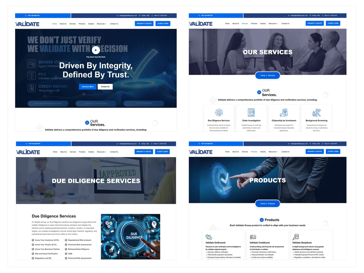
B2B Corporate Website
From insider language to a B2B journey buyers can follow.
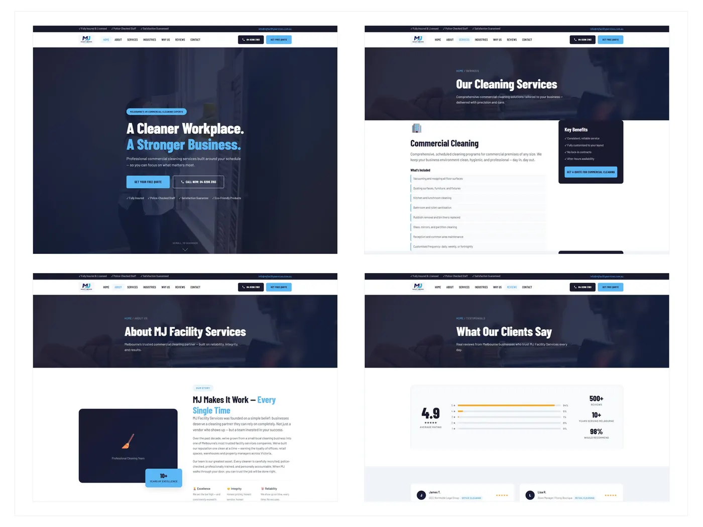
B2B Service Website
From a generic brochure to a B2B site built around the quote.
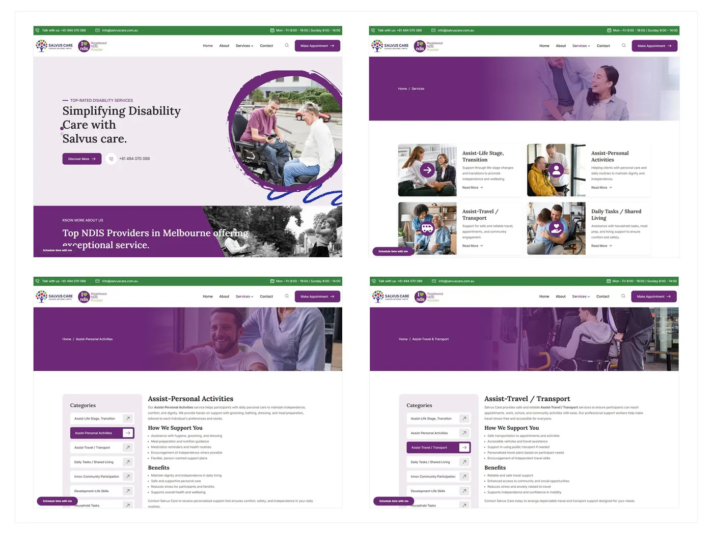
Care Services Website
From a confusing care directory to an accessible path families can follow.
Next step
If this story feels close to the pressure in your product, the useful next step is a conversation about the problem — not another gallery of screens.