
Product pressure
What the business needed to make true before the next stage of growth.
Case Study
Salvus Care
Care Services Website
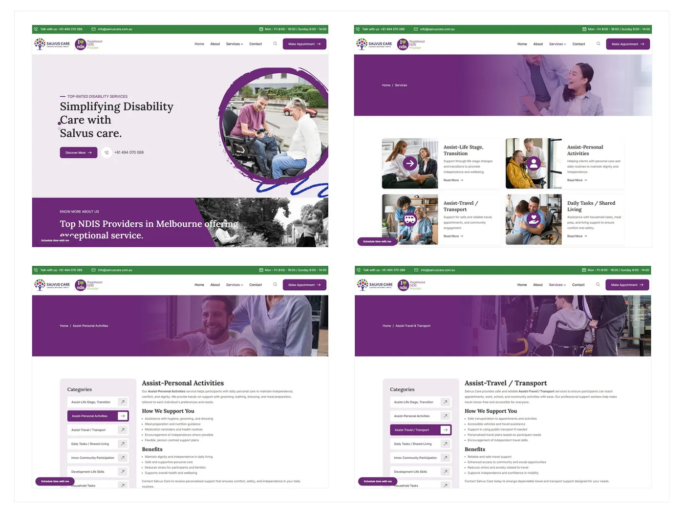
Zyvor designed and developed Salvus Care as an accessible, responsive care-services website so participants, families, carers and referral partners could understand NDIS and daily-support options — then take a next step with less friction.
Clarity and trust first.
Industry
Healthcare / Disability & Aged Care
Services
Accessible UX, Web Design & Development, Technical SEO
Engagement
Design and development
Timeline
September 2022 – December 2022
Product type
Care services website
Case study structure
Overview
Zyvor designed and developed Salvus Care as an accessible, responsive care-services website so participants, families, carers and referral partners could understand NDIS and daily-support options — then take a next step with less friction.
What the business needed to make true before the next stage of growth.
How strategy, design, and engineering stayed connected through the engagement.
The decisions that kept ownership, state, and next actions clear for the team.
Why the work was sequenced for trust, scale, and a reusable foundation.
Challenge
Care-service websites have to explain multiple support options to people who may already be navigating complex personal circumstances. If the experience is clever instead of clear, it blocks the people it is meant to help.
Signal
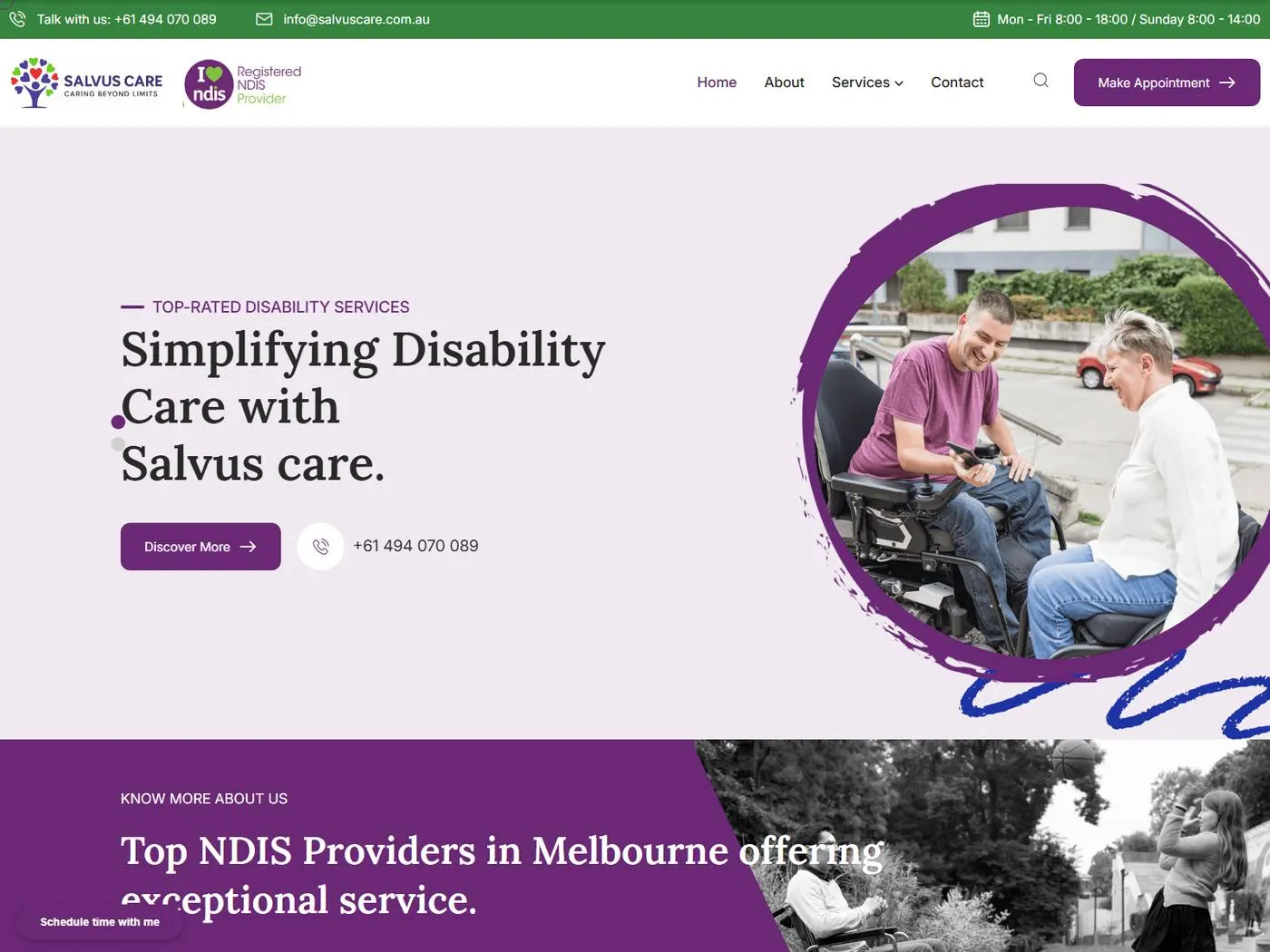
Homepage
Context
Accessible service design is a product decision.
Care-services homepage focused on trust, reassurance, and service discovery.
Salvus needed a professional digital presence that made NDIS and daily-support services understandable and enquiry straightforward.
Participants, families, carers and referral partners needed reassurance, plain language and an obvious next step.
Multiple support types needed reusable service-detail pages so content stayed consistent as the directory grew.
Vague service names, a homepage that explained everything at once, and hidden mobile navigation would have added confusion.
What was breaking
The friction points that made the old approach expensive to keep.
Service pages using vague names
Homepage explaining everything at once
Mobile navigation hiding important support paths
Enquiry disconnected from the service being viewed
Hierarchy that was hard to scan under stress
Strategy
A clear service hierarchy, reusable detail templates and simple enquiry paths would help people understand support options without friction.
Organize support services into clear categories
Use reusable service-detail templates
Keep navigation and enquiry paths simple
Validate mobile usability for visitors arriving on phones
Solution
Zyvor designed around service clarity and trust, then built accessible information hierarchy, responsive layouts, enquiry workflows and technical SEO.
Discover
Understood how participants, families, carers and referral partners look for NDIS and daily-support services.
Define
Set the service directory, reusable detail templates and a straightforward enquiry model.
Design
Created a calm, accessible hierarchy with trust-focused content and readable service pages.
Build
Implemented responsive pages, contact workflows, analytics, technical SEO, QA and deployment.
Launch / Scale
Left a maintainable service structure for additional support content.
Strategy — Key Decisions
These are the choices that shaped the product — not a gallery of what shipped, but why the work was sequenced this way.
People need to recognise the support they are looking for before they will trust the organisation.
Personal activities, travel, daily tasks and community participation should be understood in the same way.
Care decisions are often made under stress; scanning has to work.
Many visitors will arrive on phones and cannot afford a hidden next step.
Contact should continue the page the person was reading, not reset the conversation.
Design
Visitors should understand what support is available, feel they are in the right place, and know how to enquire without decoding jargon.
Care-service websites must be clear before they are clever.
Homepage focused on trust, reassurance and service discovery
Plain-language service categories
Reusable detail pages for each support type
Simple navigation and contact options on every key page
Trust, clarity and accessibility
Accessibility is part of the product, not a visual style
Trust content should calm, not overwhelm
Technical SEO should never compromise readability
Homepage
Care-services homepage focused on trust, reassurance, and service discovery.
Services
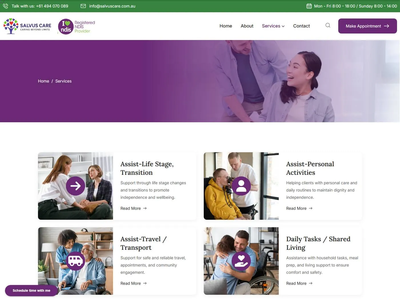
Service directory helping visitors understand available support options.
Personal activities
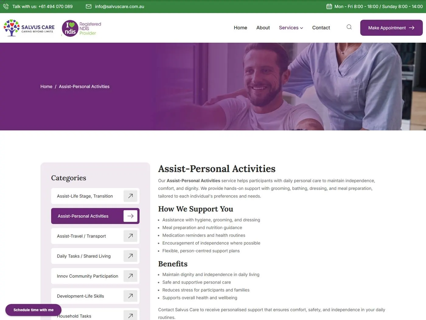
Reusable service-detail structure for participant support information.
Development
The site was built with PHP, MySQL, responsive front-end, contact forms, analytics, SEO tooling and hosting/SSL, with production deployment after QA.
Clear hierarchy and reusable service-detail templates.
Mobile-first navigation and service scanning.
Contact paths connected to the service being viewed.
Technical SEO, analytics, QA and production deployment.
Key Features
Trust, reassurance and a way into support options.
A scannable map of available care support.
Reusable service-detail structure for participant support.
A clear support page for a specific need.
Accessible explanation of everyday assistance.
Support content that stays consistent with the rest of the directory.
Another support line using the same readable pattern.
Straightforward contact from the service being considered.
Outcome
Salvus Care gained a clear professional digital presence that made support services easier to understand across desktop and mobile, with a reusable structure for future content.
Support options are organised so people can find the relevant path.
Reusable templates keep the directory coherent as content grows.
Key support paths remain usable on a phone.
New service content can follow the same accessible pattern.
Technology
The tools that supported delivery — chosen for the product shape, not as a generic stack list.
Key Takeaways
Care websites should reduce confusion for people already under pressure.
Vague labels force families to decode the organisation instead of finding help.
Consistency is how a directory stays understandable.
The next step should not require starting over.
Related Case Studies
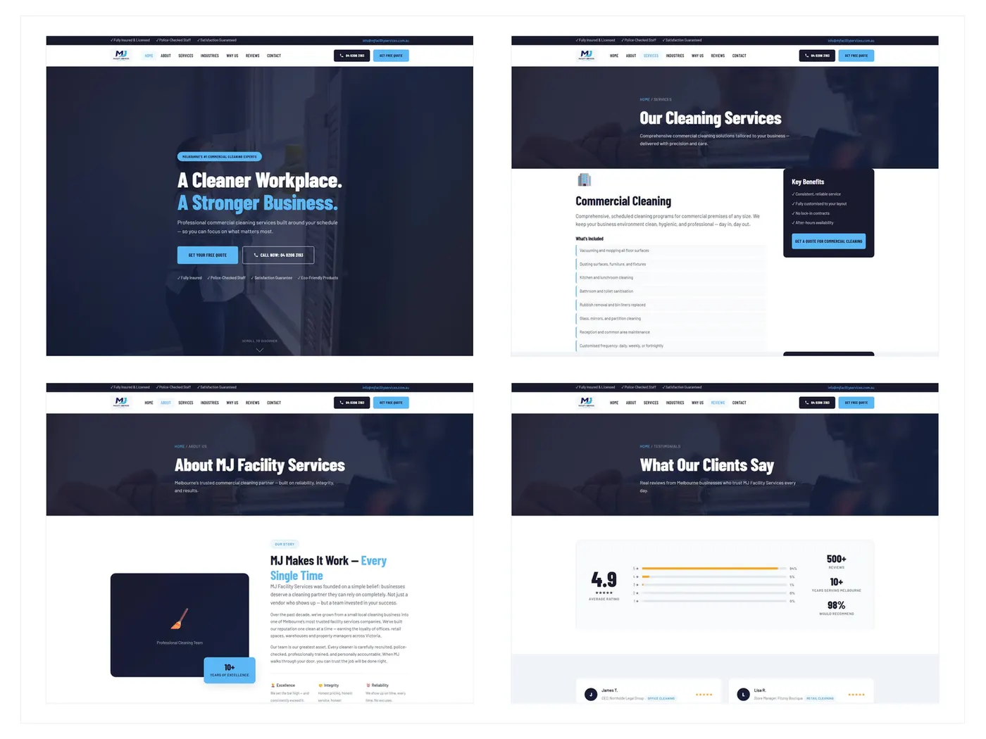
B2B Service Website
From a generic brochure to a B2B site built around the quote.
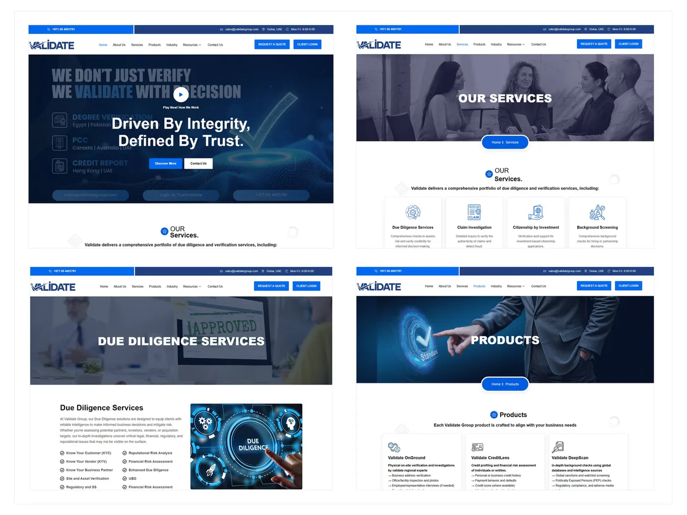
B2B Corporate Website
From insider language to a B2B journey buyers can follow.
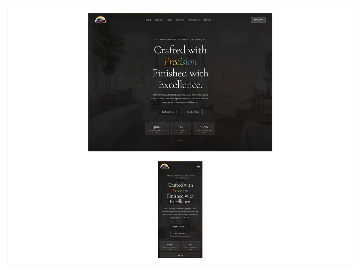
Lead Generation Website
From an unclear local presence to a site that makes enquiry easy.
Next step
If this story feels close to the pressure in your product, the useful next step is a conversation about the problem — not another gallery of screens.