
Product pressure
What the business needed to make true before the next stage of growth.
Case Study
LXR Perfumes
Luxury eCommerce
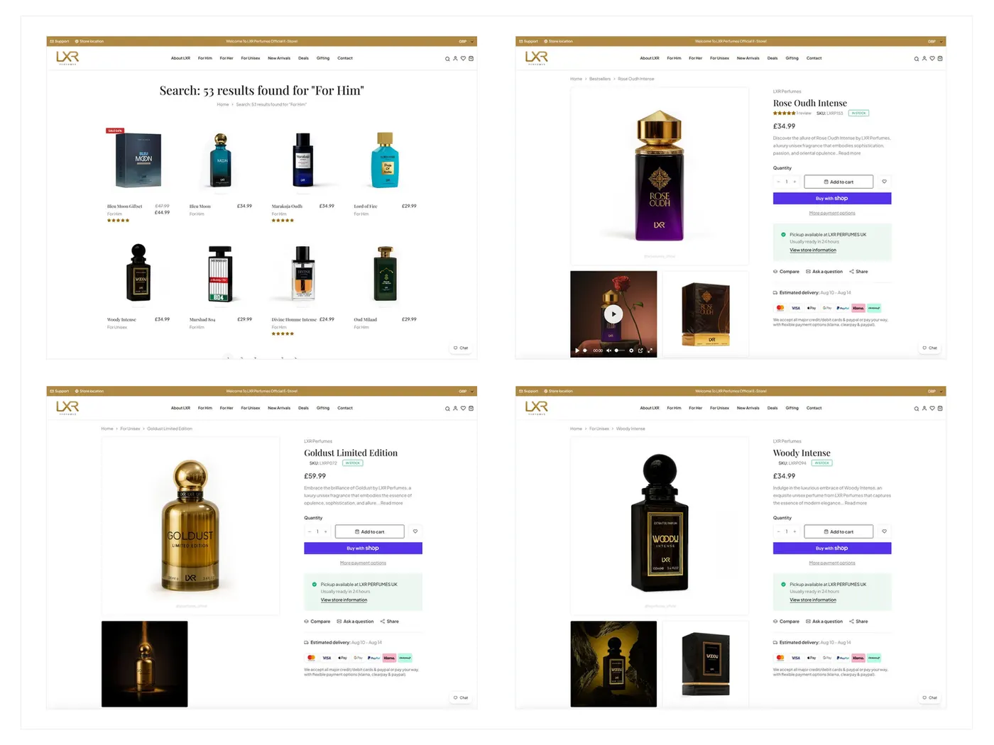
Zyvor designed and developed the LXR Perfumes Shopify storefront around discovery, merchandising, reusable product pages, responsive shopping, cart and checkout — so the brand could feel premium without making catalog work handmade.
Reusable luxury commerce.
Industry
Luxury Retail / eCommerce
Services
UX Design, Shopify Development, Merchandising Structure
Engagement
Design and development
Timeline
April 2023 – July 2023
Product type
Luxury fragrance eCommerce storefront
Case study structure
Overview
Zyvor designed and developed the LXR Perfumes Shopify storefront around discovery, merchandising, reusable product pages, responsive shopping, cart and checkout — so the brand could feel premium without making catalog work handmade.
What the business needed to make true before the next stage of growth.
How strategy, design, and engineering stayed connected through the engagement.
The decisions that kept ownership, state, and next actions clear for the team.
Why the work was sequenced for trust, scale, and a reusable foundation.
Challenge
Fragrance buyers rely on visual presentation, storytelling and a calm path to checkout. A store can look polished and still become expensive to operate if every product page is a one-off layout.
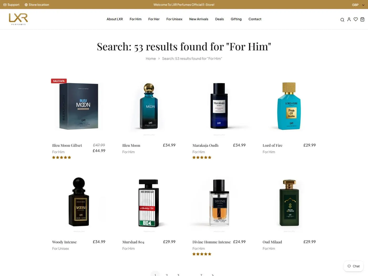
Signal
Search experience
Context
Easy to shop. Easier to operate.
Product discovery through storefront search and product options.
Catalog expansion, collections and merchandising updates needed to stay manageable as the range grew.
Shoppers needed visual confidence, clear product information and a checkout path that did not distract from the purchase.
Routine catalog work could not depend on custom development for every collection or product page.
Mobile shopping treated as a smaller desktop page would have broken the discovery-to-checkout journey.
What was breaking
The friction points that made the old approach expensive to keep.
Product pages designed as one-off layouts
Mobile shopping that lost buying confidence
Search present but not useful for discovery
Store operations depending on developer intervention
Checkout feeling disconnected from product storytelling
Strategy
If product templates, collections and search were designed as a system, LXR could keep a luxury feel while the team expanded the catalog without rebuilding pages.
Create reusable product-detail structures
Keep search, collections and discovery simple
Preserve shopping intent on mobile
Connect analytics and marketing tooling without complicating the storefront
Solution
Zyvor shaped the discovery-to-purchase journey first, then built Shopify theme customisation, reusable product templates and the checkout path around that journey.
Discover
Understood how fragrance buyers evaluate products and where catalog operations would slow the team down.
Define
Set the storefront system: collections, search, reusable product templates and checkout configuration.
Design
Created a premium responsive experience that keeps storytelling close to purchase.
Build
Implemented Shopify theme work, product structures, cart, checkout, payments and analytics.
Launch / Scale
Prepared catalog QA and release readiness so merchandising updates could continue after launch.
Strategy — Key Decisions
These are the choices that shaped the product — not a gallery of what shipped, but why the work was sequenced this way.
A premium look only stays affordable if new fragrances do not require custom page builds.
Shoppers need a way to find products beyond the homepage, especially as the catalog grows.
Fragrance buying often happens on a phone; a scaled-down desktop page would lose confidence.
The purchase path had to be reliable and maintainable, not a custom checkout experiment.
The store needed measurement without turning the storefront into an operations tool.
Design
The store should feel luxurious, then get out of the way: product story, imagery, variant clarity and a calm checkout.
Good eCommerce work has two audiences — the buyer shopping the store and the team maintaining the catalog.
Product pages built around imagery and fragrance storytelling
Search and collections as the expansion path beyond featured products
Mobile layouts that preserve discovery-to-checkout intent
Variant and pricing presentation that does not compete with the brand
Trust, clarity and accessibility
Luxury buying needs visual confidence before conversion tactics
Checkout should feel continuous with the product page, not like a different site
Maintainability is a customer experience decision because stale catalogs erode trust
Search experience
Product discovery through storefront search and product options.
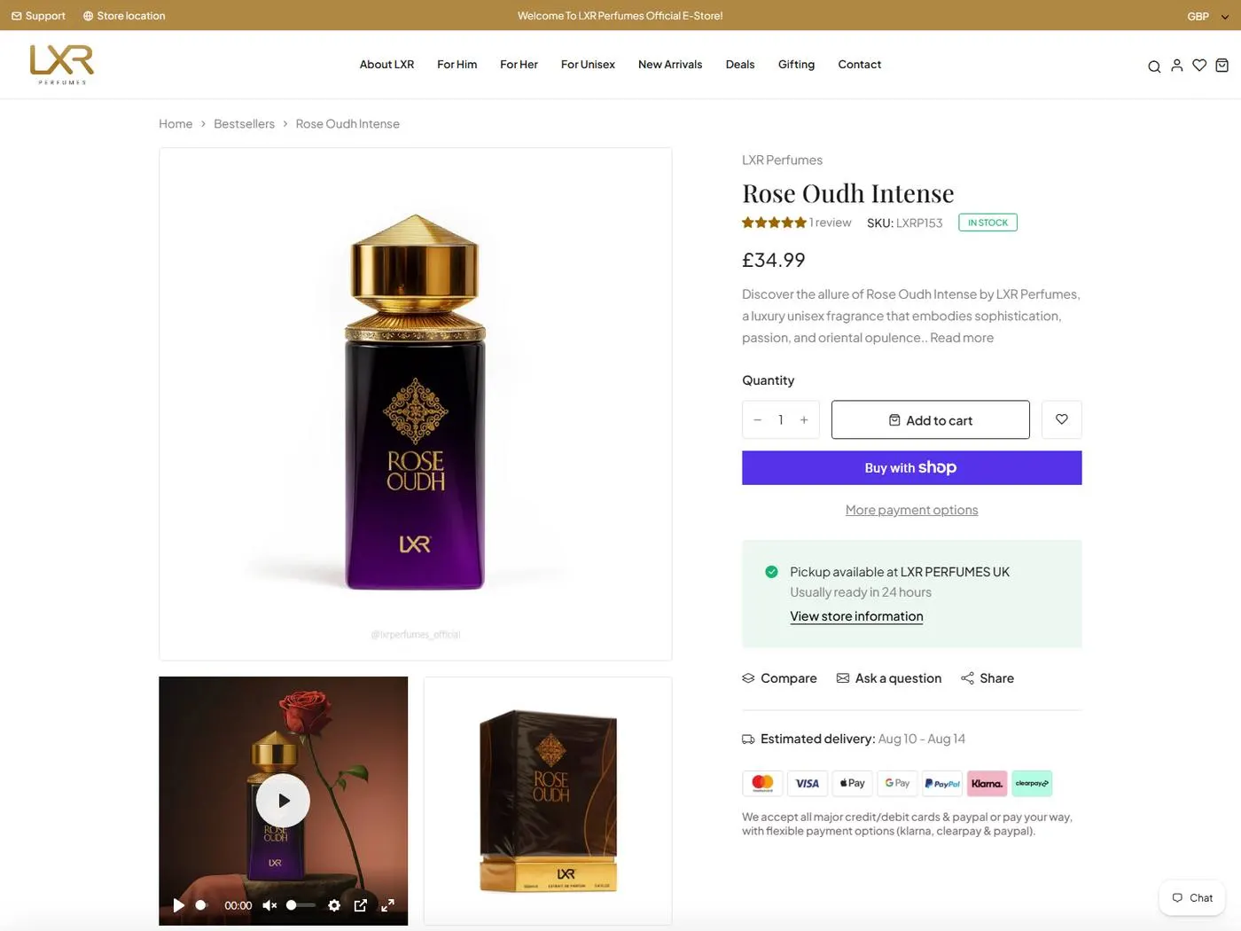
Rose Oudh product page
Product detail page for fragrance storytelling and purchase decisions.
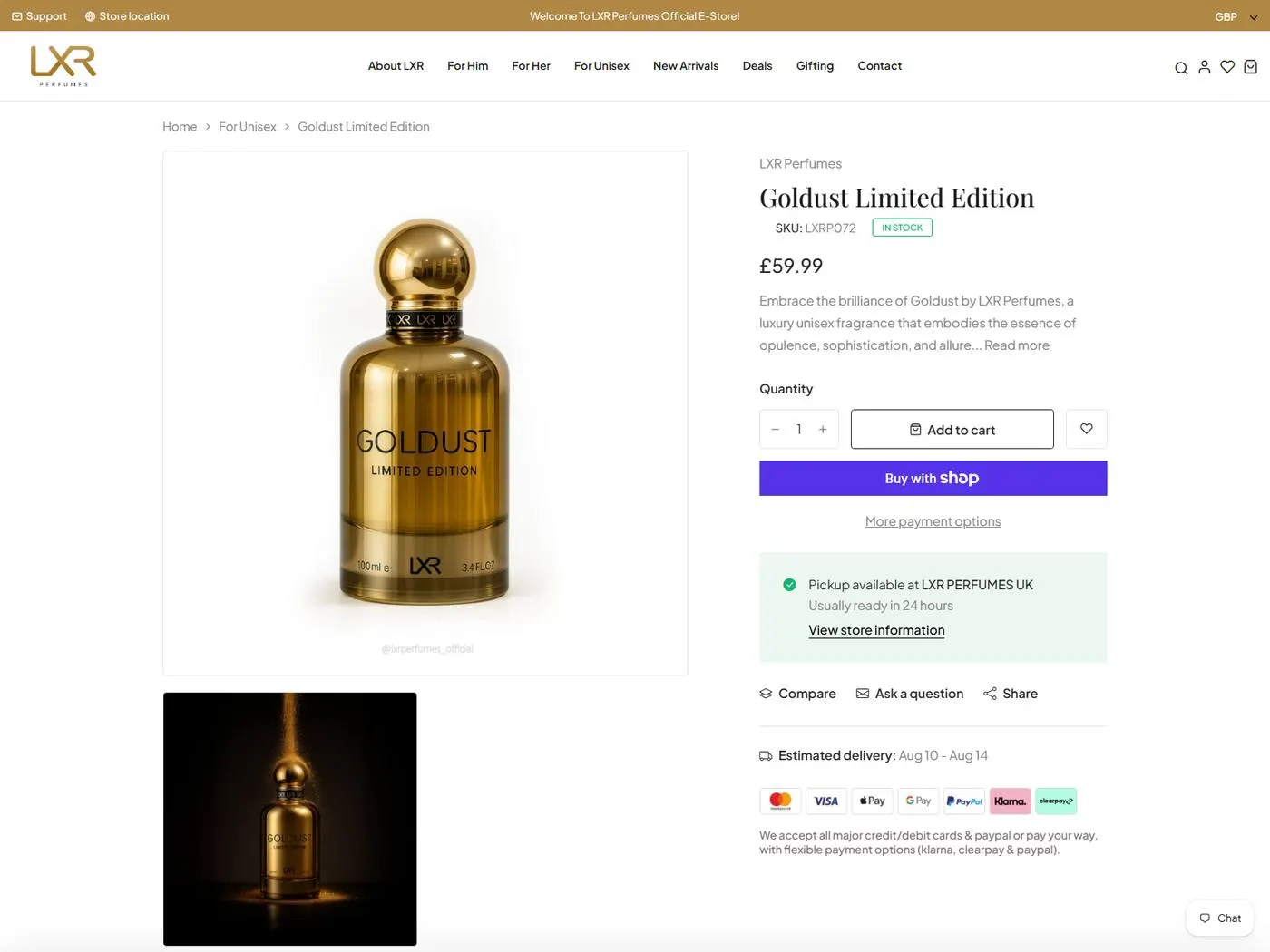
Goldust product page
Reusable product template supporting premium fragrance presentation.
Development
The engagement delivered a Shopify storefront with Liquid, JavaScript, catalog/search, cart and checkout, payment gateway setup, analytics and merchandising-ready templates.
Theme customisation around a discovery-to-purchase journey.
Reusable product templates, collections and search.
Cart, checkout and payment integration.
Analytics, marketing integrations and catalog QA.
Key Features
Premium responsive homepage and brand entry.
Merchandising structure for fragrance ranges.
Reusable product-detail pages for storytelling and purchase.
Discovery that remains useful as the catalog grows.
A clear path from product confidence to checkout.
Shopify-native purchase completion.
Responsive buying journey, not a compressed desktop page.
Measurement connected without cluttering the storefront.
Outcome
The project delivered a responsive eCommerce channel with consistent product presentation, reusable storefront structures and a clear path from discovery to checkout.
Fragrance pages share a reusable structure instead of one-off layouts.
Search, product detail, cart and checkout stay connected on desktop and mobile.
Catalog expansion does not require a custom build for every product.
Analytics and QA sit behind a storefront that still feels premium.
Technology
The tools that supported delivery — chosen for the product shape, not as a generic stack list.
Key Takeaways
The shopper and the merchandising team both have to succeed, or the storefront decays.
Templates keep presentation consistent while the catalog grows.
A fragrance store that only works on desktop loses the moment of intent.
Reliability in cart and payment protects the brand more than a custom checkout experiment.
Related Case Studies
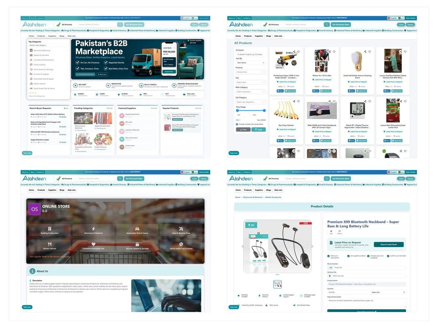
B2B Marketplace
From disconnected wholesale channels to a shared B2B marketplace.
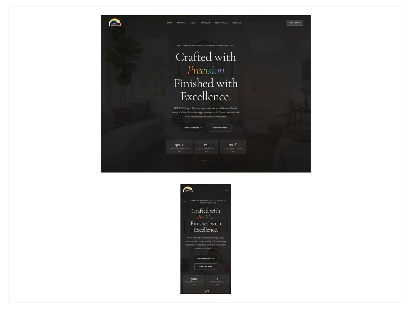
Lead Generation Website
From an unclear local presence to a site that makes enquiry easy.
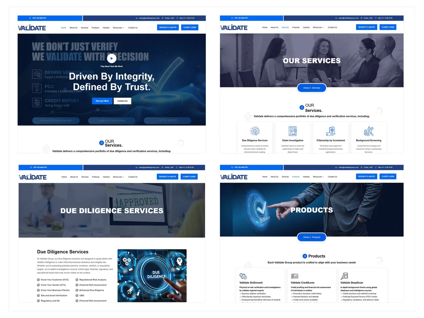
B2B Corporate Website
From insider language to a B2B journey buyers can follow.
Next step
If this story feels close to the pressure in your product, the useful next step is a conversation about the problem — not another gallery of screens.